Grey and yellow. These are the colours of the year 2021 selected by the Pantone Institute. For more than 20 years, Pantone has been choosing a colour that influences product development and purchasing decisions in various industries: fashion, industrial design, graphic design, etc. This year, for the first time in 20 years, Pantone has selected these two colours, arguing its decision as follows:
“The union of the endurance of Ultimate Gray and the bright vibrancy of Illuminating Yellow expresses a positive, powerful message. Practical and stable, but at the same time warm and optimistic, this is a colour combination that symbolises hope and optimism. We need to be encouraged and inspired – this is essential for the human spirit.”
The combination of the two colours conveys a strong message of optimism in a changing world.
Why colours are important for your brand
Choosing the colour that will represent your brand, whatever advertising material you use to promote your business, is a decision with a lot at stake: colours have a big part to play in your customer’s buying decision. Here’s why colours matter:
1. Colours make your brand more recognisable.
2. Colours are an important detail of your brand that customers will remember. According to studies, they increase a brand’s recognition by 80%.
3. Colours create mood. Research shows that they significantly influence how your potential customer feels. The most telling example of this is McDonald’s. The company’s colours – yellow and red – have been specially chosen to trigger the feeling of hunger, www.eyeem.com shows.
4. Colours influence perception. Depending on the colours chosen to represent your brand, it will be perceived as innovative, serious or otherwise, depending on the direction the colours take.
How do you choose the right colours for your brand?
When deciding which colours will truly represent your brand, you need to consider the meaning of the shades you opt for. See below for some examples of colours, and what emotion each can create:
Yellow. It is the colour of the mind and intellect, which appeals to the rational part of the brain. It expresses creativity, new ideas. It denotes hope, happiness, optimism. However, this colour should be used in a balanced way, as excessive use can cause anxiety, restlessness or denote criticism and impatience.
Grey. In colour psychology, grey represents neutrality and balance as it brings together black and white. Used individually, it can also have negative connotations, but is used successfully in combination with other colours to tone down intense hues and give a sense of balance.
Red. This colour attracts the most attention and is associated with strong emotions such as love or passion. It’s a warm colour that spurs you into action and gives you confidence. It is recommended not to use it on very large surfaces as it can become visually aggressive.
Orange. It is a colour of optimism, self-confidence and expresses an outgoing attitude. It radiates warmth, happiness and combines the energy of red with the joy of yellow. But it should be used in a balanced way, because, if used unwisely, it can denote pessimism and superficiality. In the business world, it can leave the customer with the impression that they can afford the product.
Green. Green is the colour of nature. It expresses safety, harmony, healing and stability. Darker shades of green symbolise prestige, wealth, and lighter shades denote rebirth, growth, prosperity. In the business world, green is a particularly good colour for brands associated with health, therapy and those promoting environmentally friendly products. Dark green is particularly suited to brands in the financial sector.
Blue. It is the colour of trust, of peace. It suggests loyalty and integrity, but also predictability. It is a shade that attracts calmness, reducing fear and tension. It inspires wisdom and high ideals and creates a sense of space. It is considered the safest colour to use in the corporate world and is often used in important meetings. It can also inspire a conservative attitude as well as predictability.
Colours in advertising production
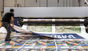
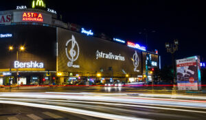
Essential to any brand is the creation of visual identity. In this process, we focus on both the aesthetic function of the advertising materials intended to promote your brand and the business objective you want to achieve through them. Our design team will recommend the colours that best represent your brand. One of the services offered by BT Production is graphic design. Our specialists will provide you with visual identity, advertising material and packaging design services. Your brand will also be able to stand out through the colours used to create printed materials. You’ll find all your digital printing, marketing and promotional product needs at BT Production. And your brand’s colours will be truly memorable with large-scale prints. These advertising materials have become part of public spaces. Their main advantage is that they attract the attention of potential customers even from a distance.