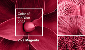
Very Peri – Colour of the Year 2022
If you’re wondering what the colour of 2022 is, Pantone, the brand synonymous with finding the perfect colour, has announced that Very Peri is the colour of 2022. Pantone explained that this purple is a “vibrant and sophisticated shade that inspires creativity and imagination”. This bold and beautiful shade of purple is also said to evoke feelings of confidence and security, making it the perfect choice for times of uncertainty. Faded purple also represents the idea of growth and renewal. If you want to incorporate this popular shade into your brand or marketing campaigns, read on.
In the color of 2022 we see a shade of purple that symbolizes creativity and imagination. This purple is a strong colour with a luxurious and modern feel. At the same time, purple conveys the idea of calm and relaxation. The refined, delicate and luxurious vibe makes the colour of the year 2022 an easy option to decline in multiple areas, and it can be successfully integrated into marketing and branding because it exudes a warm and welcoming vibe.

Codes for Very Peri, colour of the year 2022
| HEX | #6667AB |
| RGB | 102, 103, 171 |
| CMYK | 0.4, 0.4, 0, 0.33 |
Pantone winners. Colour of the Year 2000-2022
In 2000, Pantone announced that it would name a new colour each year for the next decade. They called this project “Pantone Color of the Year Winners” or “Pantone Color of the Year”. Each year, Pantone issues a press release announcing their choice and why that color was chosen.
The colours ranged from muted neutrals to vibrant brights, with one exception: the year 2021. In 2021, Pantone named two colors of the year: yellow and gray. Pantone reasoned the designation of the two colors as follows: “The selection of two independent colors highlights how different elements come together to express a message of strength and hope that is enduring and uplifting, conveying the idea that it’s not about one color or one person, but more than one” said Leatrice Eiseman, executive director of the Pantone Color Institute, in a press release.
Today, many companies benchmark Pantone’s designated colors each year for branding and marketing campaigns.
The colour of 2022, Very Peri, in branding and marketing
Combining confidence with creativity
Very Peri is the ideal choice for sophisticated and luxurious brands, but that doesn’t mean it can’t be used successfully in countless projects. The colour of the year 2022 is representative of the idea of renewal, and international benchmarks are recommended for brand communication campaigns.
3 ways you can use Very Peri in branding and marketing:
- Use it as an accent colour: a splash of purple can add a touch of luxury to any design.
- Incorporate it into company branding: this colour is perfect for creating a unified and welcoming brand identity.
- Use it in marketing materials: from flyers to website banners, purple is a great way to grab attention and stand out from the crowd.
Use Very Peri in marketing even if the brand colours are different
If you’re not working with a purple palette, don’t worry. You can still use Very Peri in marketing and branding. Here are some ways to do it:
- Use it as a secondary color: Incorporate Very Peri into your design as a secondary color. Very Peri will add a touch of warmth and sophistication.
- Use it only in certain marketing materials: use the colour of 2022 occasionally in some of your marketing materials to generate a big impact.
- Create consistent branding: if you want to create a cohesive and unified brand identity, consider using a primary colour and the colour of 2022 as a secondary colour. For the main colour, you can consider colours that work well with purple. Below, you’ll discover some ideas.
Colours that work really well with purple in design
When it comes to color, purple works really well with a variety of shades. Here are some colours that work well with purple in design:
Blue: Blue and purple create a calming and inviting feeling.
Pink: pink and purple create a warm and inviting feeling.
Yellow: yellow and purple create a bright and cheerful feeling.
Green: green and purple create a balanced and harmonious feeling.
Whichever way you choose to use it, the colour 2022 is sure to make a big impact in the world of marketing and branding this year. If you want to align yourself with the trends of the year, then it is recommended to use Very Peri in at least one marketing campaign.
Why is it important to use the colour of the year 2022 in marketing?
There are a few reasons why it’s important to use the colour of the year 2022 in marketing and branding. First, it helps you stay relevant in your industry. Secondly, it allows you to create a consistent, fresh and appealing brand identity. And finally, it gives you the opportunity to grab attention and stand out from the competition. So there you have it – a few reasons why it’s important to stay on top of the colour of 2022 in marketing and branding. So make sure you incorporate Very Peri into your next project!
What colours can we expect in the coming years?
Probably a continuation of the trends we’ve seen so far. Warmer colours will continue to dominate, with natural and earthy tones being particularly popular. Shades such as olive green, mustard yellow and terracotta will make waves in the next year or two.
We’re also likely to see an increased use of metallics, as well as bolder and more vibrant shades. As always, it’s important to keep your target audience in mind when choosing colours – something cheerful and bright might not be right for a brand that caters to the elderly, for example. Find out more about why it’s useful to use colour of the year in your promotion.